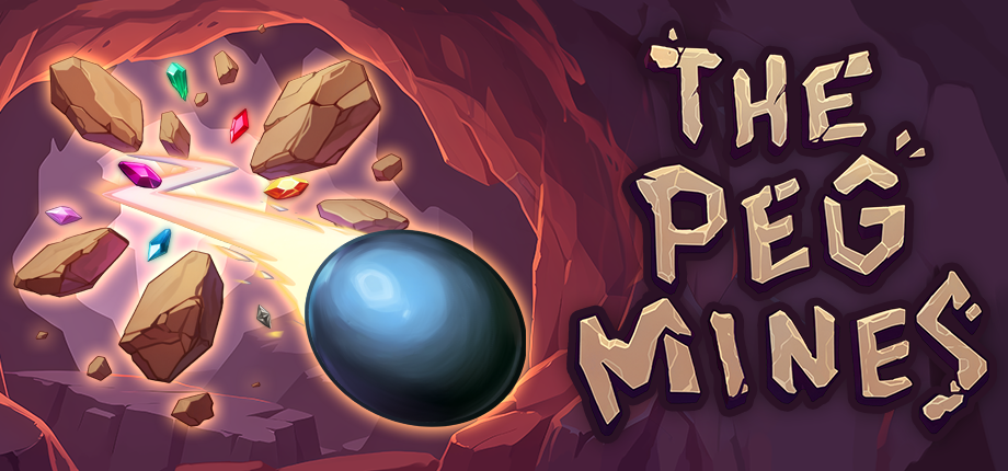
The Peg Mines
This is an early version of The Peg Mines
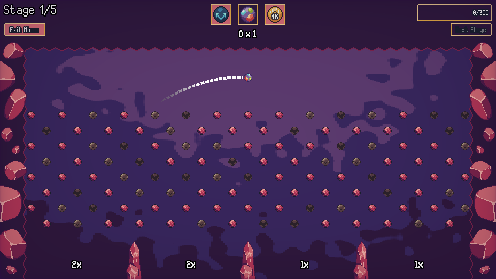
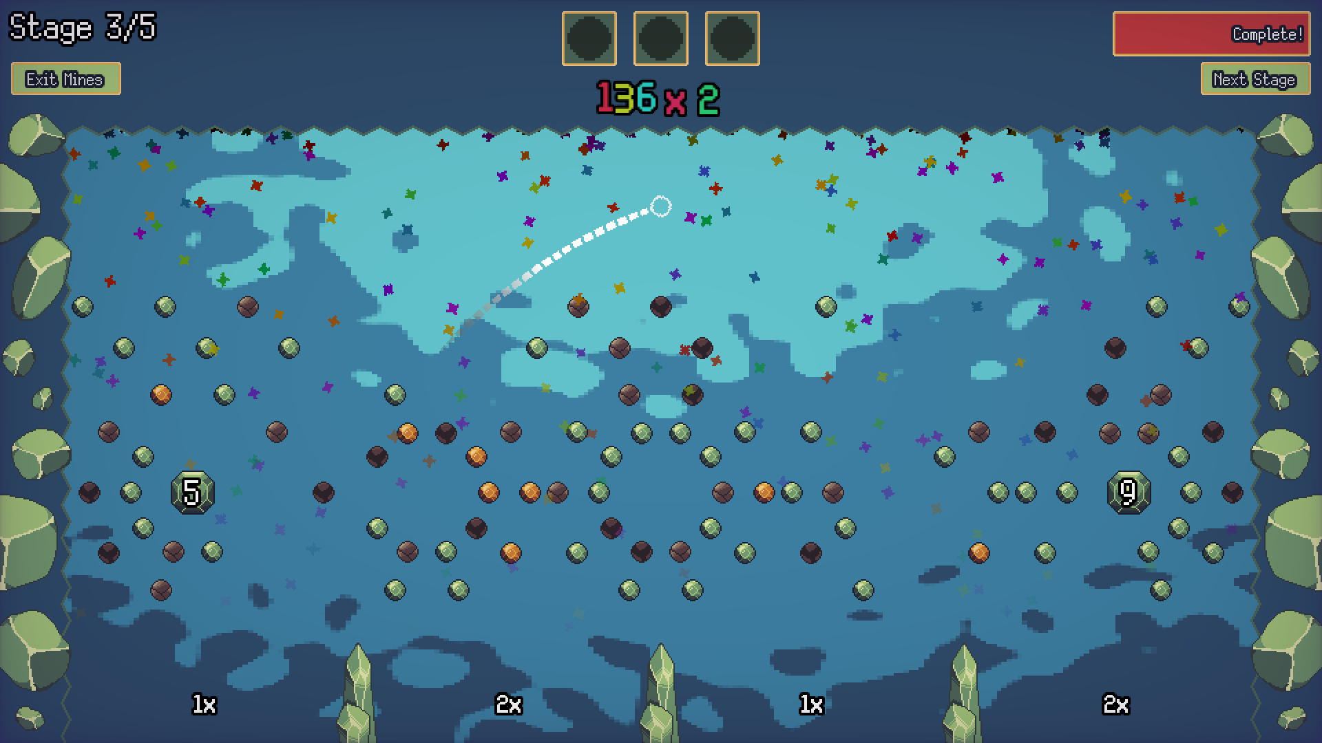
The Peg Mines is a pachinko/plinko-like incremental game about mining for tons of ore by playing pachinko. The core gameplay loop is mining for ore > upgrading your mines > crafting new balls > mine for more ore.
This is a rough draft of what will become a playable demo. As such, the controls are not explained in game, I'm working on that!
How to Play
This entire game can be played with just a mouse.
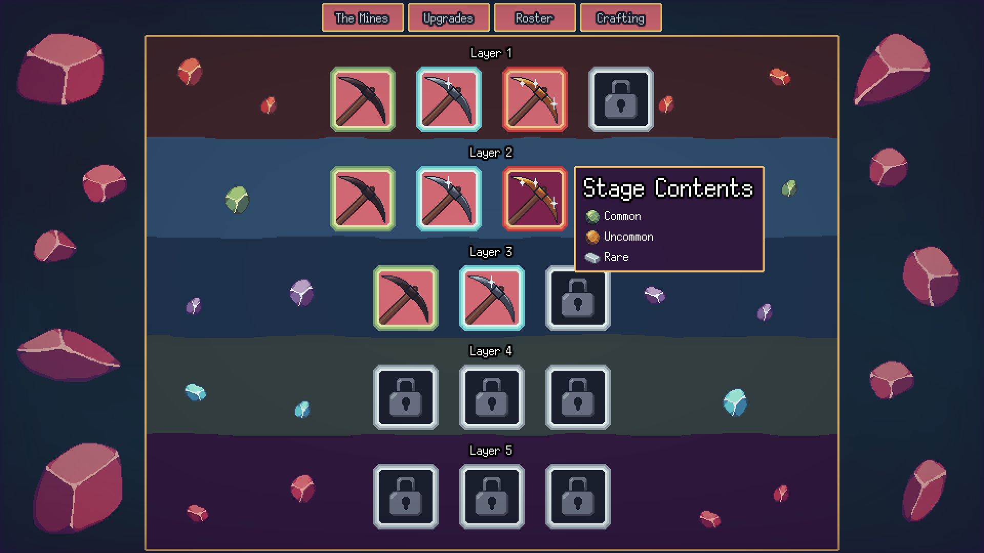
Click on a level to enter the mines
Select a ball to prepare it
Aim, and click! Only one ball can be active at a time. NOTE: The first 1 or 2 shots might stutter in-browser
In the event a ball or an ore is stuck, click on this button in the bottom right to end the turn
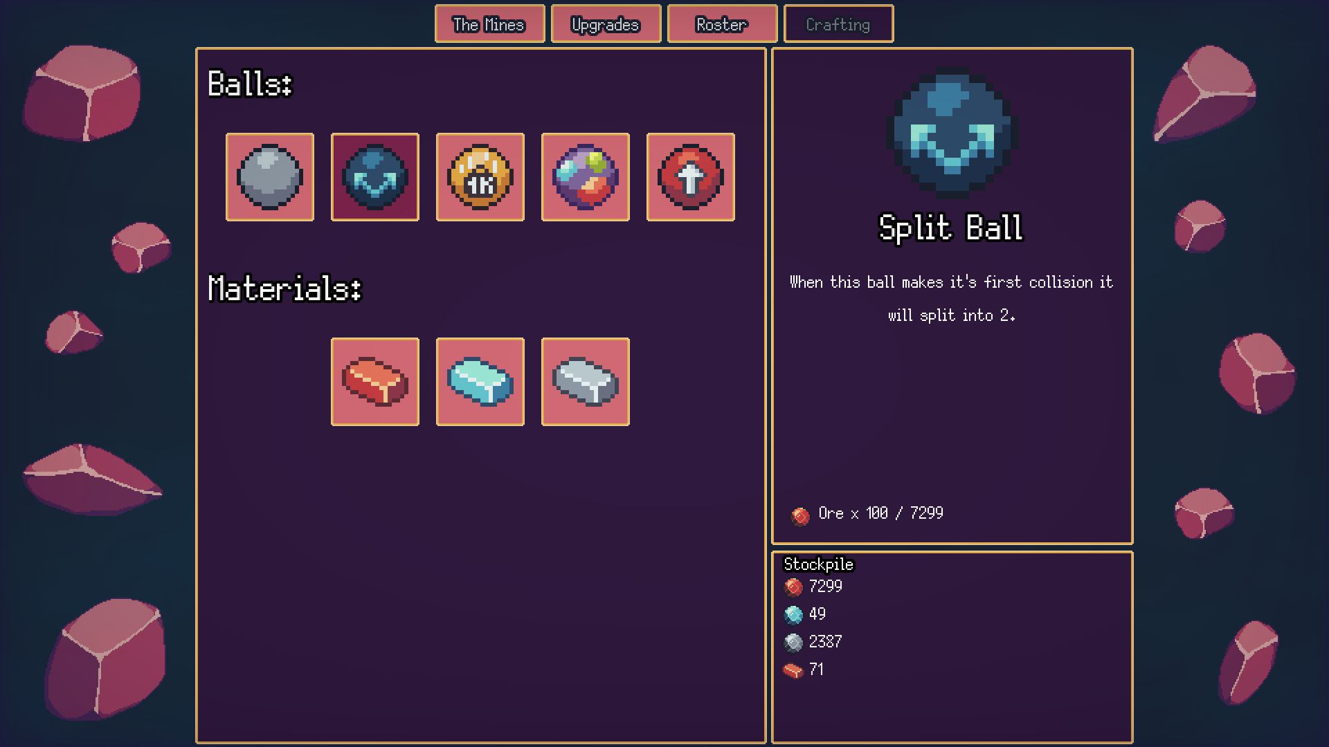
Once you unlock crafting I recommend making the "Default Ball" since it is free. Crafting plays a little differently.
Enjoy!
I hope you enjoy the game, and I would LOVE for your feedback, either through comment here, on my discord, or via email- peep.gamedev@gmail.com. I am not hard to reach.
You can find more information about The Peg Mines on Steam and Discord.


Comments
Log in with itch.io to leave a comment.
Really strong bones here, a few ideas:
1. It would be nice if the game assumed left-to-right loading from your roster so you don't have to go up and click a new ball each time. This is especially the case since a lot of browsers put their "exit fullscreen" button right in the middle of that area.
2. The player should just start with 3 default balls (even if you keep the loadout locked until the upgrades are purchased) so that they don't accidentally launch with a single ball after playing. Perhaps better, maybe just make "empty" slots use the default ball instead (unless you want to have them do something else on purpose).
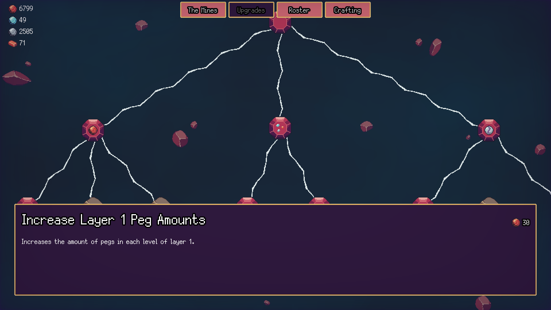
3. The upgrades screen could use a little more obvious UI hinting. It wasn't immediately intuitive to me where I was supposed to click for the first upgrade, even with the text.
Last but not least, a settings menu for audio/music toggles would be good.